- I need to have a variety of different tracks behind the trailer
- I need to have fast and slow paced shots to make the movie seem exciting
- I need it to leave the target audience wondering
- I need it to be exciting and interesting
- I need it to have lots of different shots
- I need it to link in with the magazine and poster that I have already done.
Friday, 17 December 2010
To improve my video...
Tuesday, 14 December 2010
Final Magazine Cover
 This is my final magazine cover! I am very pleased on how this has turned out and I think that this magazine would stand out from other magazines because of the bright colours. As you can see this links with all three of my products. It links with the poster because I have used the same picture, the same font for the movie and also the same colours. It links with the trailer because of the same font of the movie, the same location and the colours run throughout all of the products. This means that the target audience will be able to link all 3 product together and will find them easier. I think that the magazine has a sense of professionalism as it looks like other movie magazines that are on the market today such as Empire and many more. I have taken inspiration from Empire magazine as it is a very popular magazine that sells well and has a running theme throughout every magazine and I wanted the same effect. I have used the image as the main focus to draw the target audiences eye inwards to the picture as it is mysterious and people will want to know more.
Monday, 13 December 2010
Feed back from my magazine cover.
I am going to get feedback from my first draft of my magazine cover from my target audience to see what they think and what they think needs improving.
Chris Percival:
I think that the colours that are used work very well with the genre of the magazine and also they work well together and will attract the eye as they compliment each other. However, I think that the bottom of the magazine looks plain and needs some work to make the magazine stand out more. I think that there needs to be a tag line or something underneath the title of the magazine as well. I think that the bar code looks a little out of place also.
Ben:
I think that this is a very good first draft and doesn't need much more work. I just feel like Chris that the bottom of the magazine is boring and therefore the magazine doesn't look interesting.
Emily:
I really like the colours of the magazine, they stand out and draw the eye inwards. I like the background that is used as it shows that the films is the main focus of the magazine.
Sunday, 12 December 2010
This is my magazine so far...
 This is my magazine cover so far as you can see it is a bit plain and needs some work but I have taken the inspiration from the magazine empire and now I will get some feedback from it. I think that there needs to be more going on at the bottom of the poster as it is plain and looks boring. From this I don't think that it would attract many peoples eye.
Saturday, 11 December 2010
My layout choice
I have picked my first layout because I think that it is more striking and will catch the eye of the audience easier. I feel that this has some good techniques about it and looks professional like a real magazine.

Magazine layout 3
 I feel that this layout is very boring and simple and I have taken this inspiration from one of the empire magazines but I think that you would have to have a very powerful and striking image to pull this layout of as people may think it is boring and unprofessional.
Magazine layout 2
 I like the layout of this magazine but not as much as my last as i think that the title shouldn't slanted as it might be harder for the target audience to read. I also think that it is a bit plain and boring compared to the last one and doesn't really shout exciting.
Magazine layout 1
 I really like this magazine layout as i feel that it will be very effective and catch the readers eye. I feel like this will be a good layout as the text of the title is very big and in line with the readers eye. The strip at the bottom is very good as I will be able to feature other films and advertise other things that are in the magazine.
Friday, 10 December 2010
Feedback for magazine name Graph
 This is a graph from the feedback that I collected from my target audience in my class and this is what they thought of the names that I picked. As you can see the name that people liked the most was Royal. The name that got the least score was movie mag and I think that this is because that it doesn't sound professional and more like a children's magazine. This has chosen the magazine name for me which is Royal.
Magazine names:
I am just in the middle of making my magazine cover first draft and I am struggling with what to call in so I have got some ideas and I am going to ask my target audience which one they think is best.
- STATE
- ROYAL
- MOVIE MAG
This is the selection of names I have come up with:
Chris percival:
I really like the name Royal as I think that it will stand out and also sounds like a magazine that will sell as it has a purpose of a name (the best movie magazine around). I think that this will be a good choice.
Ben:
I also like the name Royal as I think that it is different and will look good on a movie magazine, I also think that it is better than state and movie mag as they aren't as professional sounding as Royal is. I think that the name is short and snappy and will read well.
Emily:
I like Royal as well for the same reasons as Chris and Ben have stated.
Jack:
I disagree I really like State as it will look big and bold on top of a movie magazine.
Thursday, 9 December 2010
Magazine cover research 3
 This is another movie magazine called 'empire' and I think that there is a lot of good effects that i could transfer and relate to my own magazine cover. I like the strip at the bottom of the magazine and also the big bold writing used for the main story which is obviously 'The A-Team' This is a very inspiring magazine and I could use a lot of ideas and transform them to fit my own genre. I feel that this is a very striking and in your face magazine as the text stand out because of the colours used.
Magazine cover research 2

This is another movie magazine that has a very different effect to the last one that I analysed and I don't like this one as much. However, I feel like the magazine is very striking and the picture is enticing which will draw the target audience to buy this magazine. I like the colours used as they stand out but I feel that some of the text is too big and you can't tell which text is for the main story.
Magazine cover research 1
 This is a magazine called 'Total Film'. I like bold title that this magazine uses as it enables the target audience to identify the magazine quickly. I also like the stories either side of the picture as it acts like a boarder for the picture which draws the eye inwards to the main picture and story of the magazine. From this magazine you notice the main story which is terminator salvation, this is because the picture is big and the main characters are in front of the magazine title. This shows the importance of the story. The colours also stand out from the rest but they still link together nicely. They have used read and white font which link in with the orange and yellow background of the fire. I think that what is used on this magazine is what I would like to portray on my own magazine.
Wednesday, 8 December 2010
Final Poster

Tuesday, 7 December 2010
Another Draft
I have done another draft of my movie trailer but I cant post it yet because Vimeo has been blocked and Blogger isn't letting me upload videos. This means that another draft will be coming as soon as I am able to post it.
Saturday, 4 December 2010
My next steps.
Next I need to get a picture for my poster and fade it into the background that I am already using. This will take some time to perfect this and for it to look good and effective. I also need to make more corrections to my trailer from the feedback that I have received. I need to speed my shots to make the trailer faster and make the pace of the shots quicker. This will make the trailer more intense for the target audience.
Friday, 3 December 2010
Font that I have used
This is the font that I have had to use on my poster for the effect that other posters have but also to make it look professional. 
This is called the sf movie poster font. I downloaded this font from dafont which is where I have got all of my fonts from which I have used in this process. There is 2 types of fonts here. Sf movie poster and Sf movie poster condensed. The top font is Sf movie poster and the bottom one is Sf movie poster condensed.
This is called the sf movie poster font. I downloaded this font from dafont which is where I have got all of my fonts from which I have used in this process. There is 2 types of fonts here. Sf movie poster and Sf movie poster condensed. The top font is Sf movie poster and the bottom one is Sf movie poster condensed.
Thursday, 2 December 2010
Poster first design
 This is my poster so far I think that this is a good start as it looks strong but also it shows the genre of the trailer but it doesn't take it too far and make it look unprofessional or funny.
Wednesday, 1 December 2010
Poster
I have had an idea of what I want to do on my Poster that I will be making. I want it to look similar to the crazies poster. I think that this poster is very effective and simple at the same time. I feel that I will be able to do this because I will have my main actor which is Chris on the front of the poster walking away with his back to the camera so I shoot him walking away with the knife dripping with blood in his hand.
Monday, 29 November 2010
New font feedback
 Chris
ChrisThe title looks better than before because it suits the genre better and stands out more, it also looks far more professional than the first font.
Emily
I think that it is an improvement to change the font. This one now is much more effective and I personally like the letter 'E' backwards. I also like the font colour being red because it is much more terrifiing.
Miss Walton
Colour is better suited to the genre and the overall effect is more modern and subtle than the look of the other, which was perhaps a little dated. The block lettering is also more powerful and I like the 'slashed' effect of it.
Changed my font
I have changed my font because I received a comment of Mr Taylor that he thought my font that i have already got wouldn't be taken seriously. I have now picked a different font which I think looks a lot better and doesn't look stupid. I now think that this font looks sophisticated.  This is the colour that I will be using for the font still as I think it looks good and it represent blood.
This is the colour that I will be using for the font still as I think it looks good and it represent blood. Friday, 26 November 2010
Looking at my Feedback....
From the feedback that i have received i am going to take it on board and make the changes to see what happens. I have got to remember that the feedback i have received is from my target audience so they will know what they want to see in a horror.
Feedback to my second draft
I have resulted in asking people what they think of my movie trailer second draft. This is because at the minute it isn't very good as it isn't scary enough or even as long. I am going to ask for feedback from the pupils in my class like I have done throughout the whole of the project because they know what I am going and also they are my target audience of the movie trailer that I am making meaning that they know what they like and also what makes a good movie trailer.
Chris Percival.
To improve your movie trailer, I would cut certain bits out and add other clips in, this is because at one point in the trailer, it shows Leanne, running away and it then cuts to the killer, I think before she screams it should show a quick clip of the killer, this will make it make sense. Also I think that you could maybe use 2 soundtracks to tell a better story.
Ben Murphy.
Overall, I think that the trailer has been well thought through with the storyline, setting and camera shot. One thing that would improve the trailer is the cutting between scenes. For example at one point Chris is not already running when the trailer cuts to the scene. To edit this, maybe the clip could be shortened.
Harry Pickford.
I think that becky could improve her movie trailer by making the trailer longer so it looks more professional. Also I think that there should be two types of music such as an upbeat soundtrack or a sad one.
Mr Taylor
Fonts - need to be sophisticated. Current font could be mistaken for a spoof.
Soundtrack - add variety. When antagonist appears cuts should be quicker and tempo of music should increase.
Cuts - more pace needed!
Footage from the remainder of the film - add short clips / shots from the 'rest' of the film to make it more like an authentic trailer.
Thursday, 25 November 2010
Friday, 12 November 2010
I am having trouble with timing.
With my movie trailer I feel that i am having a bit of trouble with the timing and I have a feeling that it is going to be too short. I still need to put a proper filming company at the beginning of the trailer then I am going to sit down and analise where I can fit more footage into the movie trailer to make it look better.
Wednesday, 10 November 2010
Tuesday, 9 November 2010
What I am doing at the moment
I am developing my first draft of my movie trailer at the minute and soon my second draft will be uploaded. I am trying to make my trailer a lot longer as it needs to be at least 2 minutes long. At the minute it is only 1 minute long which isn't good.
Monday, 8 November 2010
First draft feedback
Chris: I feel that the movie trailer inst as exciting as it should be therefore i get distracted and feel the need to look away and look at other things that are more interesting. However, I feel that the story line is strong and this could be easily changed.
Ben: I think that it is too short to be a movie trailer and needs to be made longer and this could be done in a variety of ways: by adding more shots, adding more effects, having still pictures and many more.
Leanne: I think that what both chris and ben have said is spot on and if these changes are made then i will be excited and interested to go and watch the full movie.
Thursday, 4 November 2010
Editing my Movie
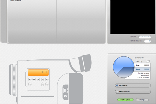
I have been editing my movie with a programme called Pinnacle studio plus 12. This has enabled me to upload my shots from my video camera to the computer easily.  This is a screenshot of the first process. This is a screenshot where you upload your footage. On this you can stop and start it on what footage you want to upload. The clips will upload in different scenes and also when you stopped and started recording on the camera. I like the way this happens because this means the footage doesn't come all together where you would have to break the footage up yourself. It is already done for you.
 This is a screenshot of the first process. This is a screenshot where you upload your footage. On this you can stop and start it on what footage you want to upload. The clips will upload in different scenes and also when you stopped and started recording on the camera. I like the way this happens because this means the footage doesn't come all together where you would have to break the footage up yourself. It is already done for you.
 This is my second screenshot of where you edit your footage that you have collected. As you can see it is split up into 3 sections. The scenes of the movie you have uploaded, the screen where the movie that you have edited so far where you watch it and then finally the timeline at the bottom of the page where you put all your sounds, clips titles and much more to edit and make the movie/trailer.
 This is the toolbar that is on the side of the programme which allows you to do many things to the videos or pictures that you have imported into the programme. The first icon is where you import a movie that you have already done or a movie that you are still finishing off doing and editing. The second icon which is of a lightning bolt is where you can add as many tranisitions as you want to, to the picture or movie that you have imported. The third icon is where you can add a montage theme onto the pictures or movie that you have put into the clip. This is where it shows one picture then shows the whole screen of pictures and goes into another. I dont think that this is a very good tool to use when you are doing a movie trailer because it doesnt make it look scary which means it doesnt run with the genre of the film. The "T" is where you add titles onto the movie or pictures. This allows you to add writing on the picture, before the picture or at the end of the picture.
 Tuesday, 2 November 2010
Tuesday 2nd November
Today I have been editing some of my clips that I have filmed to see what they look like put together. I have had some fun messing around with the editing and the transistions that I could use. I will play around with this until I get the trailer perfect. I am doing the editing on Pinnacle studio plus 12. I will soon be uploading my first rough cut of my movie and where I think that the clips will go to try and make a story line.
Friday, 29 October 2010
My schedule
This is the schedule that i planned:
- actors/actresses arrive at my house at 1.30
- 1.30-1.45 set up the first scene and the video camera
- 1.45-2.15 film the first scene until perfect
- 2.15-2.45 film the second scene of putting the tent up and Leanne walking off
- 2.45-3.15 film the thrid scene where the actor chris is following leanne
- 3.15-3.45 film the final scene where the screams happen and the two other girls hear their best friend screaming
- 3.45-4.15 look over the recording and see if there are any mistakes in the filming and redo them.
This was my schedule for the day and it worked very well. Everything went to plan.
Filming Started
On Tuesday I went out filming and got my first draft done. The weather was windy and raining. Which I didn't think would be good at first but it added to the scary effect and made the day look duller then usual. I got my four actors to come together on the same day at the same time. This meant that the schedule that I put together all went to plan and everything was done smoothly.
Friday, 22 October 2010
Seventh poster draft
 On this poster I have made the picture black and white which I really dont like but I have made my main heading bigger which looks a lot better and I have kept the slogan the same size. Meaning that it looks more effective and the title is the first thing that catches the customers eye. This is also because of the colour of the title as it stands out from the rest of the colours used on the page. I think that the heading works very well but the picture isn't great neither is the colour of the picture.
Thursday, 21 October 2010
Sixth poster draft
 On this poster I have used my own picture but I feel that this picture doesn't work at all. I think that the lightness of the picture makes the poster look like a different genre movie then a horror movie. This might be miss leading for the audience. I also think that this picture is not as effective as the picture i used before. I think that this is because it isn't in the right location but also this is a picture that I got for my location I am just using it for an idea. I still think that I will keep the border background as dark brown instead of black. I think that the main title is too small on this poster as it should be the biggest thing on the page.
Fifth poster draft
 This is the fifth poster that I made and I think that this one is the best yet. I like that the colour link together and also I think that the red title looks so much better against the dark broun background then the black backgrouns as it doesnt contrast so much. I think that the picture is the main part of the poster and really cacthes the audiences eye well as it is striking but yet simple as the same time.
Fourth poster draft
 On this poster mock up I have made the girl in the picture coloured to make her stand out. I also experimented how the girl would look all red but this didn't work out too well. I think that this is effective but I dont think that this technique would work very well.
Third poster draft
 On this poster I have just made the black banner a dark grey and everything else I have kept the same.
Second poster draft
 This is my second draft that I have created I have made everything the same except I have taken the block out at the bottom because I was thinking that it was too much and didnt link in very well with the picture that I have used. I have also made the girl smaller which makes the poster look more realistic and professional then what it was like before. I think that the whire writing at the bottom of the poster looks very good on the picture and I like the fact that the picture is bigger and covers more or the page as it is more eye catching and people will be more attracted to the poster as it stands out more. I have but a white line between the picture and the black block at the top of the screen that is a banner. This is because I think that it looks a lot better then it just being straight onto it. I am very attracted to the black and white theme that I have created on these mock ups. I think that this links in to the genre that I have picked and also the plot that I have created. I think that I will use this black and white colour scheme form my actual poster and the only colour that will be on the screen is red as it will make the title same out a lot more.
 First Poster draft.
This is my first draft that I have created. I have took the idea of this poster from paranormal activity because that has the two black blocks at the top and bottom of the poster. I think that the black blocks that I have used look a little too dark which is a bit too sharp for the picture that I have used. I have put my title and the slogon in the top block and then I have put a rating from News of the World with their star rating and quote as well. I have also included the logo and the certificate that my movie is going to be. I like the font that i have used for the rating from News of the World as it is plain and simple and represents that they are a news paper. I have made the font white so that it stands out on the black background. I feel that this bottom block looks a bit too sharp as it doesnt blend in as much as i would like it too. Also the girl that I have used looks too big and should be smaller. This is just a rough mock up but I think that it is very similar to what I want to end up with. I have used a darker red then normally so it doesnt look to bright and looks more spooky. I think that this contrasts well with the black that I have used. I have put the slogan in a white colour so that it stands out under the red title. I have made the title the biggest text on the poster so that it stands out the most which makes it eye catching.
 that I have created. I have took the idea of this poster from paranormal activity because that has the two black blocks at the top and bottom of the poster. I think that the black blocks that I have used look a little too dark which is a bit too sharp for the picture that I have used. I have put my title and the slogon in the top block and then I have put a rating from News of the World with their star rating and quote as well. I have also included the logo and the certificate that my movie is going to be. I like the font that i have used for the rating from News of the World as it is plain and simple and represents that they are a news paper. I have made the font white so that it stands out on the black background. I feel that this bottom block looks a bit too sharp as it doesnt blend in as much as i would like it too. Also the girl that I have used looks too big and should be smaller. This is just a rough mock up but I think that it is very similar to what I want to end up with. I have used a darker red then normally so it doesnt look to bright and looks more spooky. I think that this contrasts well with the black that I have used. I have put the slogan in a white colour so that it stands out under the red title. I have made the title the biggest text on the poster so that it stands out the most which makes it eye catching.
 Monday, 18 October 2010
The props I am going to need...
I am going to need a lot of props when filming this movie trailer. I will list the things that I will need when filming below;
- I will need a tent
- I will need small suitcases (bags)
- I will need 3 female actors
- I will need 1 male actor
- I will need fake blood
- I will need a knife that wont be used in a harmful way
- I will need clothing for all my actors
- I will need an umbrella
- I will need some twigs
- I will need black clothing for my male actor
I think that this is all the props that I will need. I will add to this post if I think of anymore props that I will need before filming. This post will help me to keep organised because I can refer to this post just before filming so I will know wether I have got everything that I need.
Friday, 15 October 2010
At this stage...
At this stage I feel that I have completed most of my planning for my movie trailer and think I need to start focusing on getting the ideas for my DVD cover, back and spine and also a front cover of a film magazine. I will need to think about how I am going to link them with my movie trailer and what I am going to do to make it work well. If I am going to use a picture from a scene for the whole background of my DVD cover or if I am not going to fill the whole background with a picture. I also need to think of the layout of the magazine but also the layout of my DVD cover. This is all important because it will stand out more if you make everything focus on the picture or the main image in the picture so that your making everything else look like a boarder.
The other logo I am using
I am going to be using a logo that is already established as well as my own on my movie trialer because I think that it will make my movie trailer look more professional than just having my own logo that I have created. But I think because I am going to be using a company logo that is just used for horro movies then people will think that my movie will be good if I am working with a well know production company.
The company logo that I am going to be using is the Full Moon Entertainment logo. This logo is just used for horror movies and the lgog represents that. I feel that this logo will fit in with the genre very well and also the colour scheme that I have picked for my own logo is used in this logo as well. This backs up what i said on my earlier post about blue and black is a popular colour.

My Company Logo
 My company Logo
This is my Company logo that will be going at the beginning of my trailer. I think that this is a good logo that I have created because it is big bold letters using colours that catch the eye easily because the light blue contrasts with the dark blue and the black that I have used. I think that the shapes make the logo stand out more because it makes it look very professional. I have chosen that colour blue and black because I have done some research from other company logos that have been used and found out that a lot of the logos use blue and black. Maybe not in the manor that I have but these colours seemed popular.

From these logos that I have researched you can see there in every logo except one they have used blue. This might be to show the sky or other aspects in the logo but blue is on them. Black is also very common in the these logos because it makes the logo stand out because it is on such a dark background. This is what i have tried to do by making the shapes I have used bold and 3d looking. I have also tried to make my font look 3D by having a shadow form on the writing.
Thursday, 14 October 2010
Pinnacle Studio Plus 12
This is the other movie maker that I can use for my movie trailer when I come to produce it. In this post I am going to be talking about the features that this programme offers.
 This is the toolbar that is on the side of the programme which allows you to do many things to the videos or pictures that you have imported into the programme. The first icon is where you import a movie that you have already done or a movie that you are still finishing off doing and editing. The second icon which is of a lightning bolt is where you can add as many tranisitions as you want to, to the picture or movie that you have imported. The third icon is where you can add a montage theme onto the pictures or movie that you have put into the clip. This is where it shows one picture then shows the whole screen of pictures and goes into another. I dont think that this is a very good tool to use when you are doing a movie trailer because it doesnt make it look scary which means it doesnt run with the genre of the film. The "T" is where you add titles onto the movie or pictures. This allows you to add writing on the picture, before the picture or at the end of the picture.
 This is a screenshot of the kind of texts that you can put at the beginning of your movie trailer. This is my logo that I am using for my movie trailer and I feel that this is a good and bold logo for the production company e.g. me to use for my movie trailer. I will put this at the front of my movie trailer to show the target audience who has made the movie. I think that this is a big bold logog that will catch people's eye because the colours stand out and work well together. I have also found that the main colours that people use for logos are blue and black. I like the writing that I have picked on the text because it is bold and stands out from the bold black background.
 Finally these are the tabs at the top of the screen which tells you what order to do the movie in going from step 1 to 3. The fist tab is where you import the footage that you have collected or the photos that you have taken. On this tab you can also take footage on the programme if you have got a webcam. The second tab is where I have just explained where all the features are as this is where you edit the footage and filming that you have collected throughout the days/hours you have been filming for. Finally the third tab is where you produce the footage into a movie to make it professional and work on other computers. This means that you have completed the movie trailer all together. For my movie trailer I think that I am going to use Pinnacle studio plus 12 because I think that it holds more features and is a lot better than windows movie maker. This will make my movie trailer look more professional then doing it in windows movie maker.
 This is the toolbar that is on the side of the programme which allows you to do many things to the videos or pictures that you have imported into the programme. The first icon is where you import a movie that you have already done or a movie that you are still finishing off doing and editing. The second icon which is of a lightning bolt is where you can add as many tranisitions as you want to, to the picture or movie that you have imported. The third icon is where you can add a montage theme onto the pictures or movie that you have put into the clip. This is where it shows one picture then shows the whole screen of pictures and goes into another. I dont think that this is a very good tool to use when you are doing a movie trailer because it doesnt make it look scary which means it doesnt run with the genre of the film. The "T" is where you add titles onto the movie or pictures. This allows you to add writing on the picture, before the picture or at the end of the picture.
 This is a screenshot of the kind of texts that you can put at the beginning of your movie trailer. This is my logo that I am using for my movie trailer and I feel that this is a good and bold logo for the production company e.g. me to use for my movie trailer. I will put this at the front of my movie trailer to show the target audience who has made the movie. I think that this is a big bold logog that will catch people's eye because the colours stand out and work well together. I have also found that the main colours that people use for logos are blue and black. I like the writing that I have picked on the text because it is bold and stands out from the bold black background.
The camera on the toolbar is where you insert pictures into the programme which allows you to be able to add pictures into the movie. The pictures are shown in a thumbnail view which allows you to see the picture clearly. I like that the pictures are shown like this because i can see what is on the picture clearly without having to click on them. But if i want to click on them then they  come on bigger on the right hand side of the programme which shows the whole detail of the picture. When you have put a picture into the movie then the picture will be ticked off. This is a screenshot showing this.
 come on bigger on the right hand side of the programme which shows the whole detail of the picture. When you have put a picture into the movie then the picture will be ticked off. This is a screenshot showing this.
 The sixth icon on the tool bar is where you can add a title menu at the beginning of the movie but this doesnt really occur to me as I think that this feature should only be used when you are making a DVD style video.
The speaker icon on the toolbar is where you add sound effects onto the picture or video. I think that this could work well if you are using any animal sounds in your video. I will be using one of the animal sounds when I do a clip of the owl because I dont think that I will be able to get an owl to make a sound because I would probably scare it off when filming.
The final icon is where you add a proper soundtrack to run all the way through the movie if you want it to. This is the icon which allows you import the music into the programme. I will be using this quite a lot of times as I will be putting many different soundtracks on the trailer to show all the different emotions the characters are feeling. 

This is a screenshot of the screen that plays the movie whenever you want it to and I think that this is good because it has a timer at the bottom of ti which allows you to see the exact time that everything is happening and whether it works well or not. There is also a volume button on the screen which means that you dont have to use the computer volume. Finally you can make the screen a lot bigger if you want it to go full screen so that you can see the full detail of the pictures and the video of what is going on.
This is the timeline that is at the bottom of the programme which allows you to see everything that you have imported into the movie meaning the  soundtracks, sound effects, pictures and movies, transitions and the titles. You can make the timeline bigger or smaller by using the zoom in and out button. Also the orange line at the top of the pictures is the time of which all the pictures and how long it lasts in total. This can turn green when you add a tranisition or text into the video to show you that it will take some time to add into the movie and to take place. When it turns orange again then that is when you know it is complete and is ready to play.
 soundtracks, sound effects, pictures and movies, transitions and the titles. You can make the timeline bigger or smaller by using the zoom in and out button. Also the orange line at the top of the pictures is the time of which all the pictures and how long it lasts in total. This can turn green when you add a tranisition or text into the video to show you that it will take some time to add into the movie and to take place. When it turns orange again then that is when you know it is complete and is ready to play.
  Finally these are the tabs at the top of the screen which tells you what order to do the movie in going from step 1 to 3. The fist tab is where you import the footage that you have collected or the photos that you have taken. On this tab you can also take footage on the programme if you have got a webcam. The second tab is where I have just explained where all the features are as this is where you edit the footage and filming that you have collected throughout the days/hours you have been filming for. Finally the third tab is where you produce the footage into a movie to make it professional and work on other computers. This means that you have completed the movie trailer all together. For my movie trailer I think that I am going to use Pinnacle studio plus 12 because I think that it holds more features and is a lot better than windows movie maker. This will make my movie trailer look more professional then doing it in windows movie maker.
 Monday, 11 October 2010
Windows Movie Maker
I have been using Windows movie maker to make the animatics I have done so far. I have taken screenshots of the programme that I have been using and what is so important about the programme which makes the animatic good.
 This is the first screenshot that I have taken. It shows where all the pictures and files get imported. This means that all of the pictures and files are all in the same place which means that it is easier to see where everything is. I also like the fact that you can see the pictures very well which makes it very clear on what you are putting on the time line. You are able to see all the files including if it is a sound file or a picture. This is good because it is very easy to find everything but also something that is good about this is that the pictures come up as thumbnails which enables you to see all of the picture.
This is a picture of the timeline at  the bottom of the Windows movie maker programme. This is a good feature because you are able to see how long the picture or video lasts for and also you can see what tranisitions you have used or the sounds. I think that this is good because it enables to see the picture of video clearly and this makes it easier to match the music with the picture or the video. The zoom button also makes this easier as you can zoom in or out as much as you want.
 the bottom of the Windows movie maker programme. This is a good feature because you are able to see how long the picture or video lasts for and also you can see what tranisitions you have used or the sounds. I think that this is good because it enables to see the picture of video clearly and this makes it easier to match the music with the picture or the video. The zoom button also makes this easier as you can zoom in or out as much as you want.
 This is the screen where they play the video for you and also it plays automatically if you put a tranistion on a picture or a video which is good because you are able to see if it works well or not. If not then why it doesn't work well. This is also a good feature because you are able to play your video whenever you want all the time and also pick where you want to start your movie from to make sure that all the timings are right. It tells you the time of the film playing at the bottom of this feature so you know at what point the movie is going well or not. You can also make this screen bigger so you can see everyhing that is going on in the movie in more detail.
All these features that are on the programme are all good and key to making a good movie trailer. I also think that Pinnacle 12 is also a very good programme and might even better. I am going to look at what Pinnacle 12 has to offer in my next post and then see which is better and will make my movie trailer better.
Monday 11th October
In this lesson we were taught about Pinnacle 12 and how to use it. I thought that this was a very good lesson as I am near the stage of filming my movie trailer and putting the footage together. This allowed me to learn about all of the transitions and the special effects that you can put on the footage to make it look better and more effective. This gave me more of an idea of how to use a different software rather than windows media maker. This would make the footage look better than doing it in windows movie maker. I have also been taught how to import the footage and the sound tracks. I will soon be posing some example footage that someone else has done to show you the effects and transitions that I will be using in my own movie trailer. I will also be using this software to do another animatic so that you will be able to see the difference between using Pinnacle and Windows movie maker.
My pitch
On Friday in lessons I did a pitch in front of the class to tell them my ideas and what I had already had planned. This meant that I was able to get feedback from the pupils in the class to see what I have done well and what I haven't done well. This was good for me because the pupils in my class are the same age as my target audience for my movie trailer. This meant that I asked them what they thought of my plot so far and I got some feedback from my first plot and they were very glad that I changed it because they thought that I gave too much away in my movie trailer. From my new plot they think that it is very good and goes very well with the location I have picked, the title and font colour and font that I have used. This gave me a lot of confidence and makes me want to produce a good movie trailer to live up to the plot I have done. This means that I need good footage and be able to edit the footage well.
Sunday, 10 October 2010
Wednesday, 6 October 2010
Slasher Animatic Draft 4
This is my fourth draft for my trailer and I have now included more titles, more songs that mix well together and also more effects on the pictures. I think that it is looking better but I need to make the trailer last up to about 3 minutes so it is like a professional trailer. I am going to try and do an animatic on the pinical software because then I will be able to add more effects like zoom and so on. This will make it look a lot better.
Tuesday, 5 October 2010
Final Font choice and colour

This is my font with the colour that I think that I am going to use in my movie trailer and also in my DVD cover and my poster. I like this colour of red because i think that it portrays blood more realistically then pure red does. I think that the colour of the font and the font work very well together as you can actually tell that blood is dripping from the font now where as before when the font was black it didn't look realistic and also it didn't look like blood. I think that this goes very well with the plot that I am doing but also I think that it works well with the murder weapon I am using and blood drips of a knife very easily and this shot will be the last shot of my trailer before the title comes up.
Monday, 4 October 2010
Further Clothing Ideas for my actor
In this post I am going to have ideas of what my actor is going to be wearing in my movie trailer. Throughout the trailer my actor will not change because he will be in the same clothes because he is after someone and isn't staying somewhere plus he isn't a girl who needs to change all the time.


These are the kind of clothes that I am going to get my killer to wear because I think that he needs to be in black clothing so the actresses are less likely to see him meaning he is harder to spot. I have asked my actor to wear a black hat even though he will have a hood on because if the hood comes off then you still wont see anything other than the colour black. This is the same with the shoes because you have to think about everything to make sure that it looks realistic. If I was able to get army gear/camouflage uniforms then I would put my actor in that because that would look better with the green and browns of the woods. However, these clothes will still be good and still have an effect on the audience.
Further Clothing Ideas for my actresses
From my earlier post on my clothing ideas I have thought more on what clothes my actor and actresses are going to wear and now I have got some pictures on the ideas that I have already come up with.


Actresses clothes
For the first couple of shots:
This is the kind of clothes that my actresses will be wearing when I shoot my first couple of shots of them getting ready in the bedroom and also walking down the woods and setting up the tent. This outfit will show the target audience that they are not used to the outdoor environment and what actualy clothes you are meant to wear. However, when they are packing you will see them putting wellies and tracksuits to get changed into so they know a bit of what is required when you go camping. These clothes show that they are happy and excited about going on the holiday.


Later on in the trailer
This is the kind of clothes that my actresses are going to be wearing. This is the casual look that most campers should wear. This shows that they do have some camping knowledge as they have dressed correctly to go bed or sit around the camp fire. This is the kind of clothes that my actor will wear when going to collect some firewood. I think that this outfit sums up the laziness of the camping holiday that the girls have taken.


Subscribe to:
Posts (Atom)